- Case study
- UX design
Savvy
A budgeting dashboard for college students, with JPMorgan Chase
I led a 5-person team and designed the final screens for Savvy, a dashboard that helps college students see where their money goes and warns them before they overspend.
01 The Problem
Budgeting is a critical skill for college students, but many of us never learn it. Budgeting tools exist, but they often assume financial knowledge students don't have yet, or they're too complex to stick with. Without a clear picture of their money, students make choices that threaten their financial independence, often without realizing it. Our goal: a tool simple enough to use from day one and smart enough to warn students before they overspend.
02 My Process
6 steps, from the first brainstorm to testing. Pick one.
Step 01 · Week 1
Starting broad
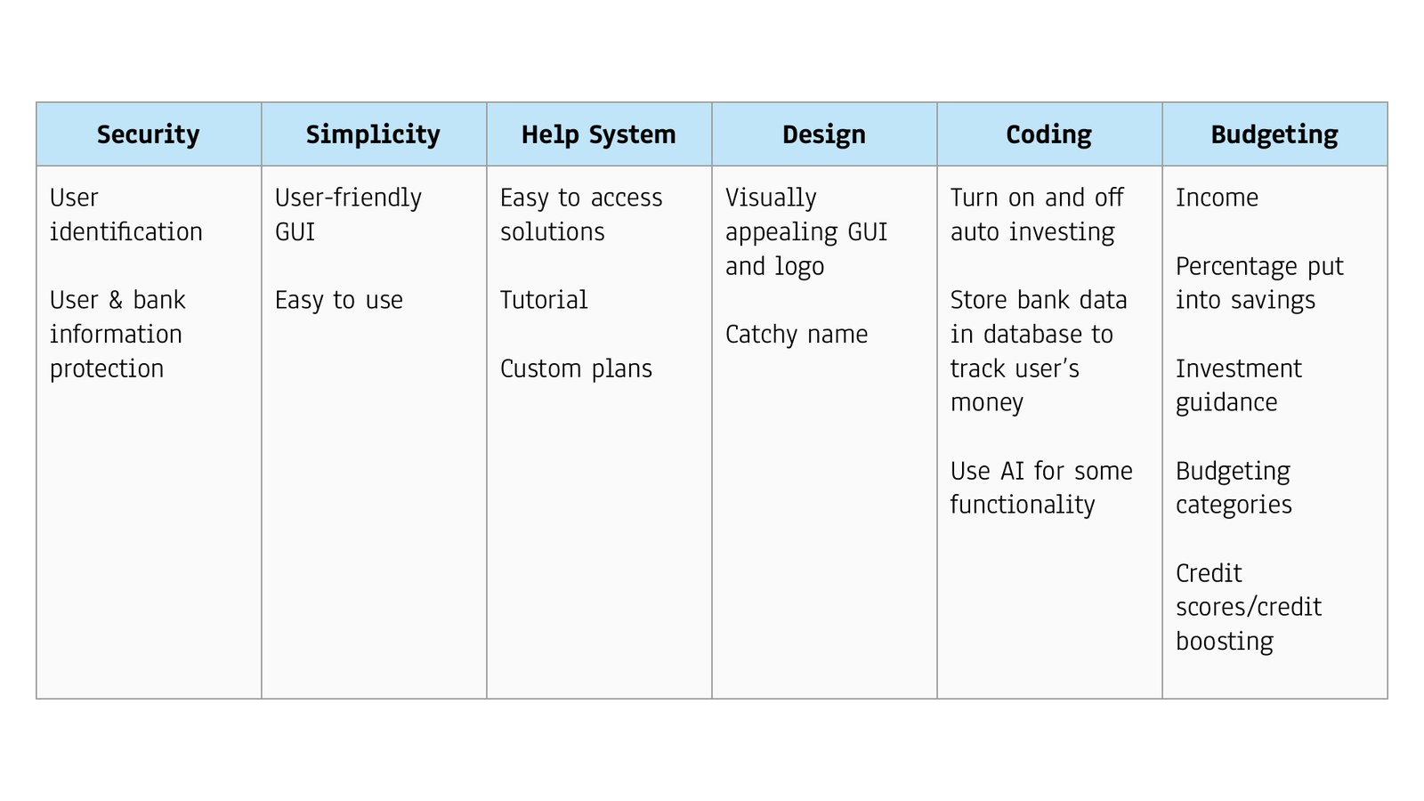
In my first semester at Illinois Tech, my team was paired with JPMorgan Chase software developers on a 9-week project. We started broad, covering security, simplicity, a help system, design, coding and budgeting guidance. Our first idea was an auto-investing system that splits a paycheck into categories. From there we narrowed to what students need every day: seeing where their money goes, setting goals and being warned early.
- Problem framing
- Requirements
03 The Solution
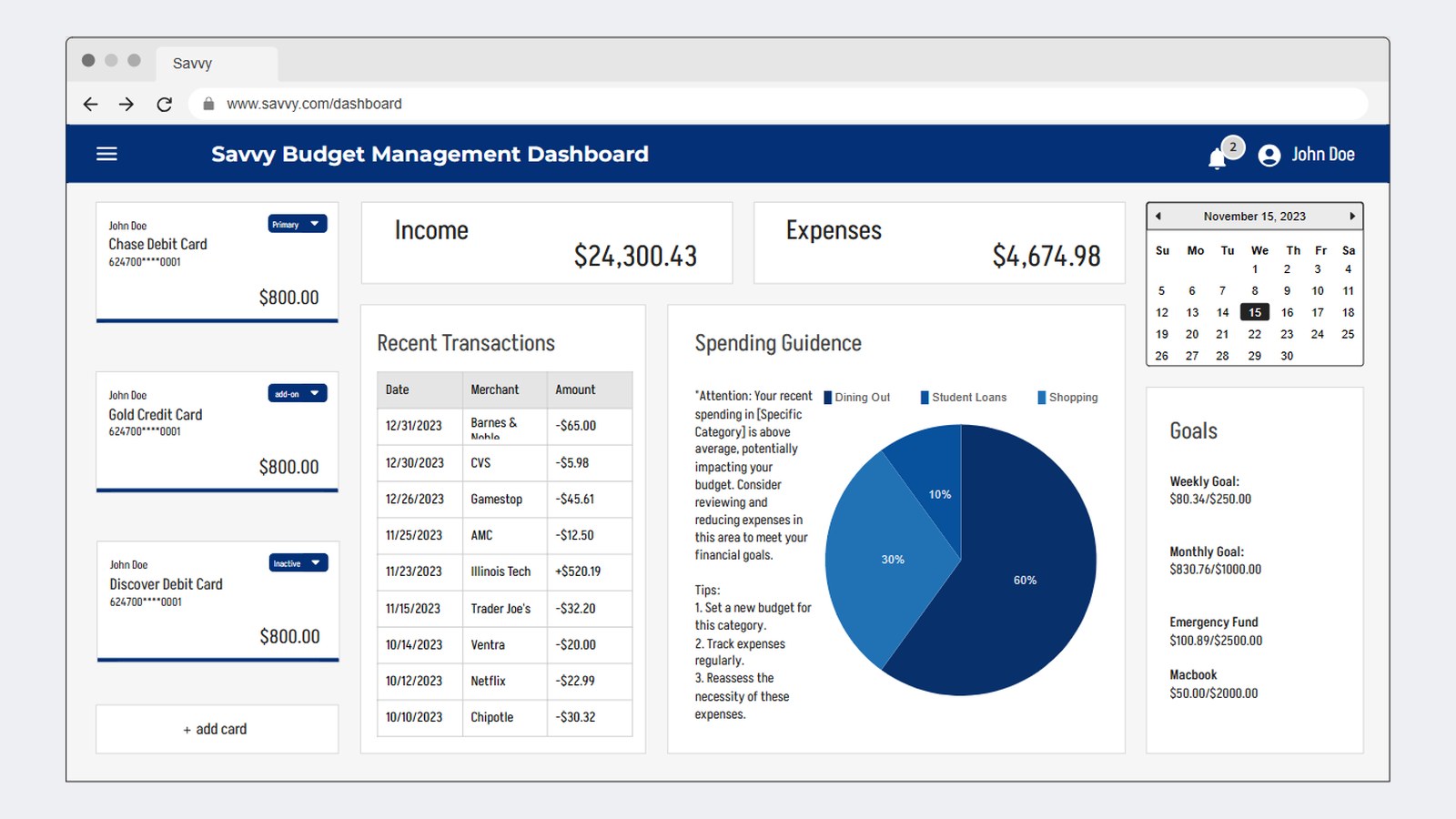
Savvy, a desktop budgeting dashboard for college students. Income and expenses sit big at the top, next to recent transactions, spending guidance, a bill calendar and card management. Bank notifications become transactions students can edit (merchant, category, fixed or variable expense, amount), so the numbers match their real life. A monthly budget page sets a goal for every category. In all, six feature modules: expense tracking, spending visualizations, reports, bill management, income management and accessibility.
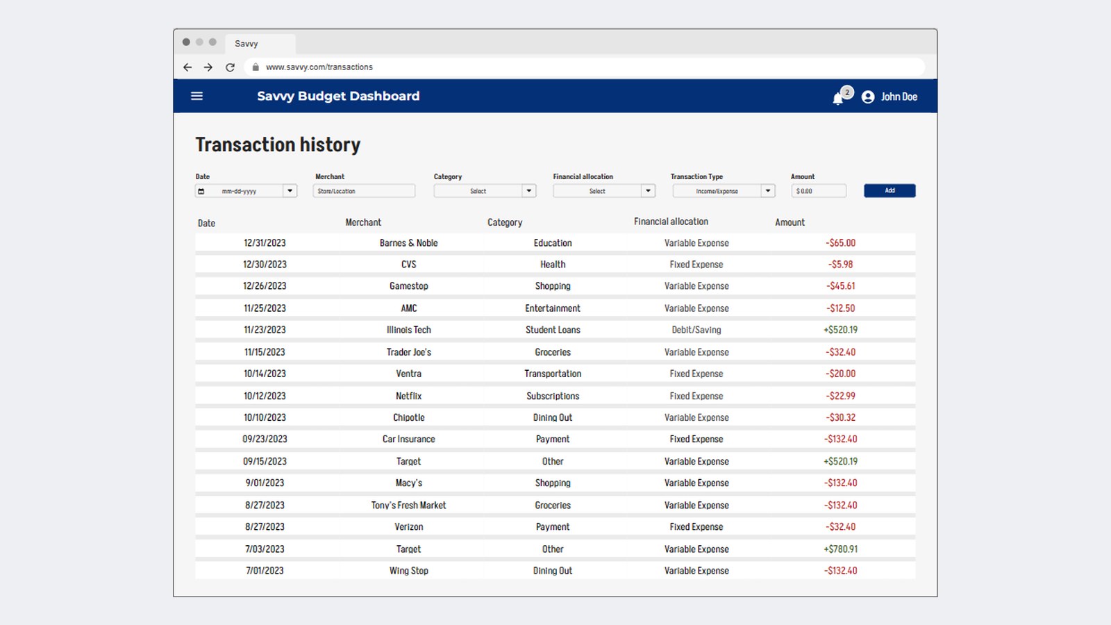
Transaction history, filterable by category and fixed vs. variable expenses.
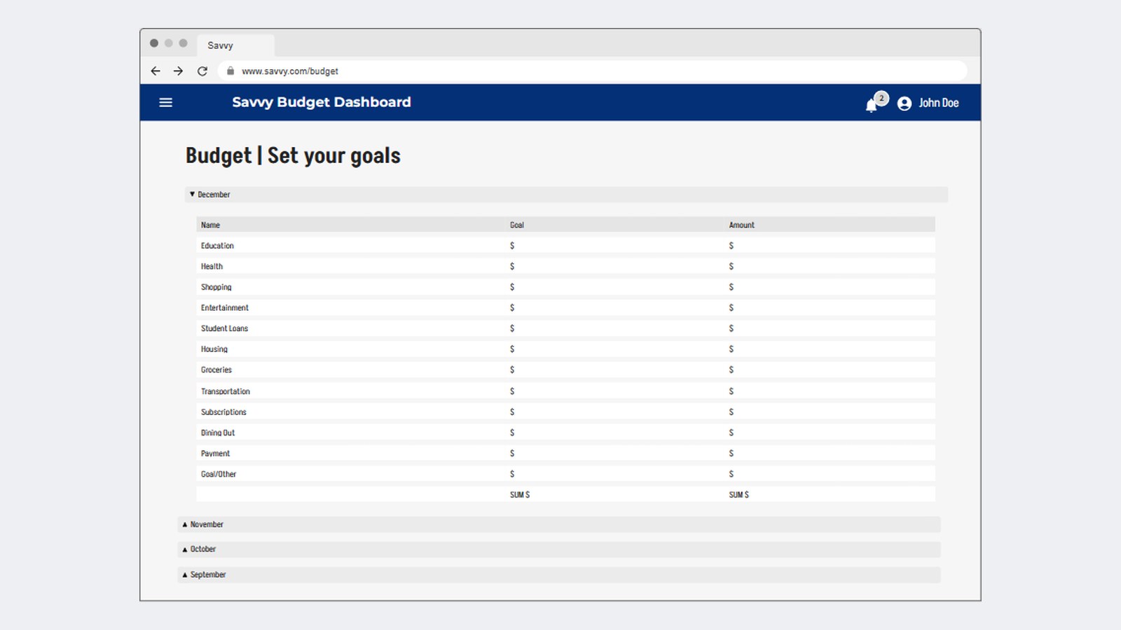
Monthly budget goals by category.
04 The Outcome
I built and delivered our final presentation to our JPMorgan Chase mentors. Their feedback was strong across our process, architecture, testing and presentation. Our weak spot was research: our validation was informal conversations with other students, and as first-semester freshmen, our visual design got little direct critique. The project taught me how Agile and Scrum teams work, how front end, back end and APIs connect, and how to lead a team.
What I'd change: Run structured usability tests with real students instead of informal feedback, and set clear task ownership from week one. Next, on my own time, I'm turning Savvy into a mobile app, starting with usability testing and more accessible design: higher-contrast text, clearer type and charts that don't rely on color alone. Planned start: winter break, December 2026.