Design Principles: PARC, Type & Color
Five lectures and a hands-on exercise that taught incoming Illinois Tech freshmen to design with intent: proximity, alignment, repetition and contrast, plus type and color fundamentals.
- Year
- Summer 2026
- Role
- CS & Design Lead
- Audience
- Incoming Illinois Tech freshmen
- Tools
- Google Slides, Google Classroom, Google Drawings, Adobe Color
01 The Context
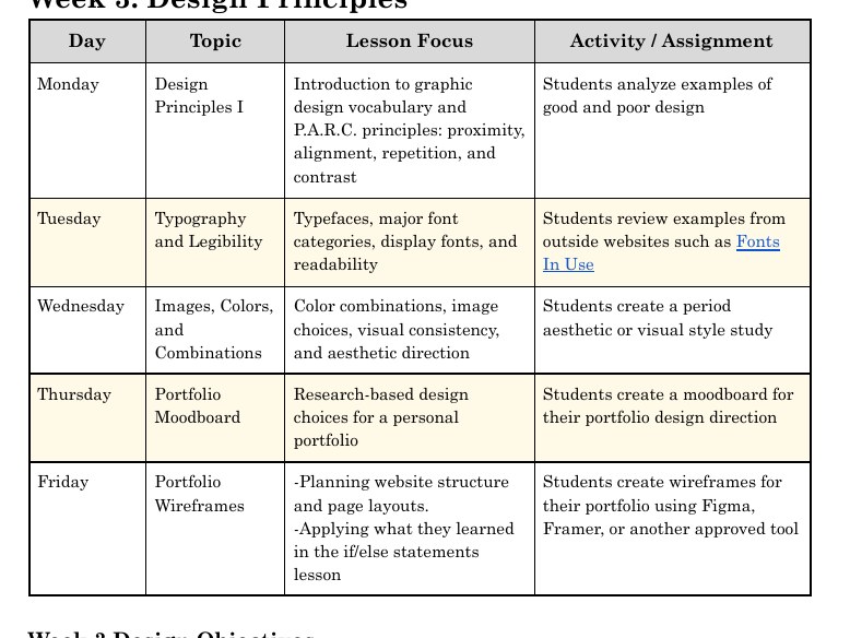
Week 3 of the Exelon Summer Institute introduced graphic design to incoming Illinois Tech freshmen who would design and publish their own portfolio the following week. They needed a framework they could apply quickly and use to explain their choices, because, as the syllabus puts it, design choices should have a reason. I built the week around the PARC method, after Robin Williams' design principles, then extended it into typography, color theory and visual culture.
02 My Approach
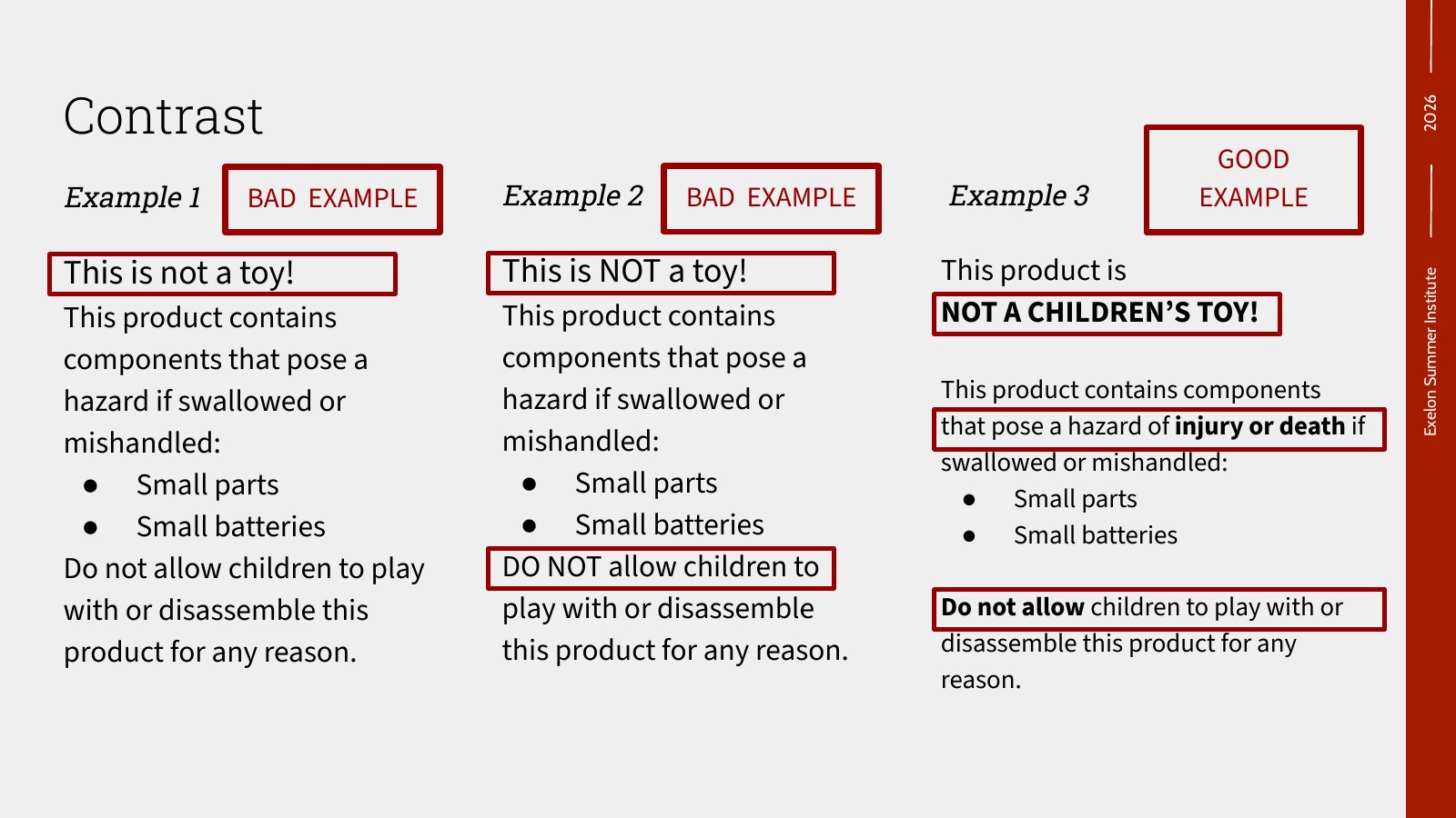
Show bad next to good. Every principle is taught by comparison, like three versions of one warning label, so students see the difference before they hear the rule.
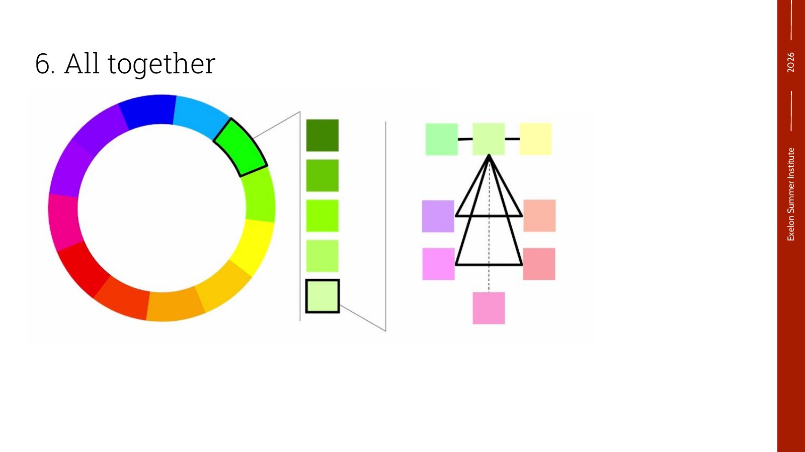
Color is a system, not a favorite. Students build a full palette step by step from one base color, then use color to direct attention and group information.
Research before you design. The exercise asks students to study one era and one designer from it before choosing a single font or color.
Practice for the real thing. The period board is a rehearsal for each student's portfolio design board the following week, using the same process.
03 The Lectures
Five lectures and one exercise. Pick one to see the slides.
Part 01 · Week 3 · Monday
The PARC method of design
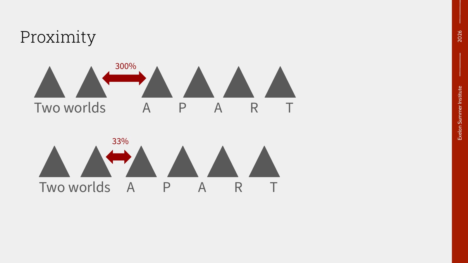
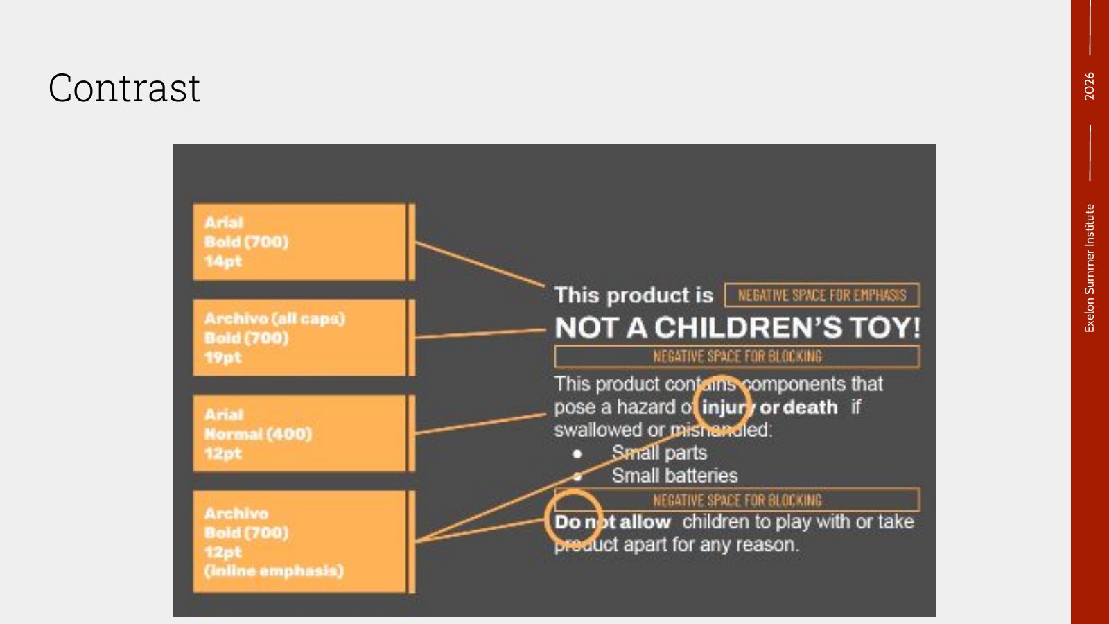
Proximity, alignment, repetition and contrast, taught with side-by-side examples. The same shapes read as one group or two depending on spacing, and three versions of a hazard label go from muddy to unmistakable. Students then analyzed real examples of good and poor design, and talked about when breaking the rules works.
- Proximity
- Alignment
- Repetition
- Contrast
Make things that should be different very different.
04 The Outcome
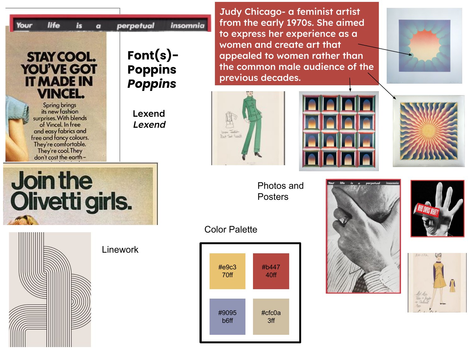
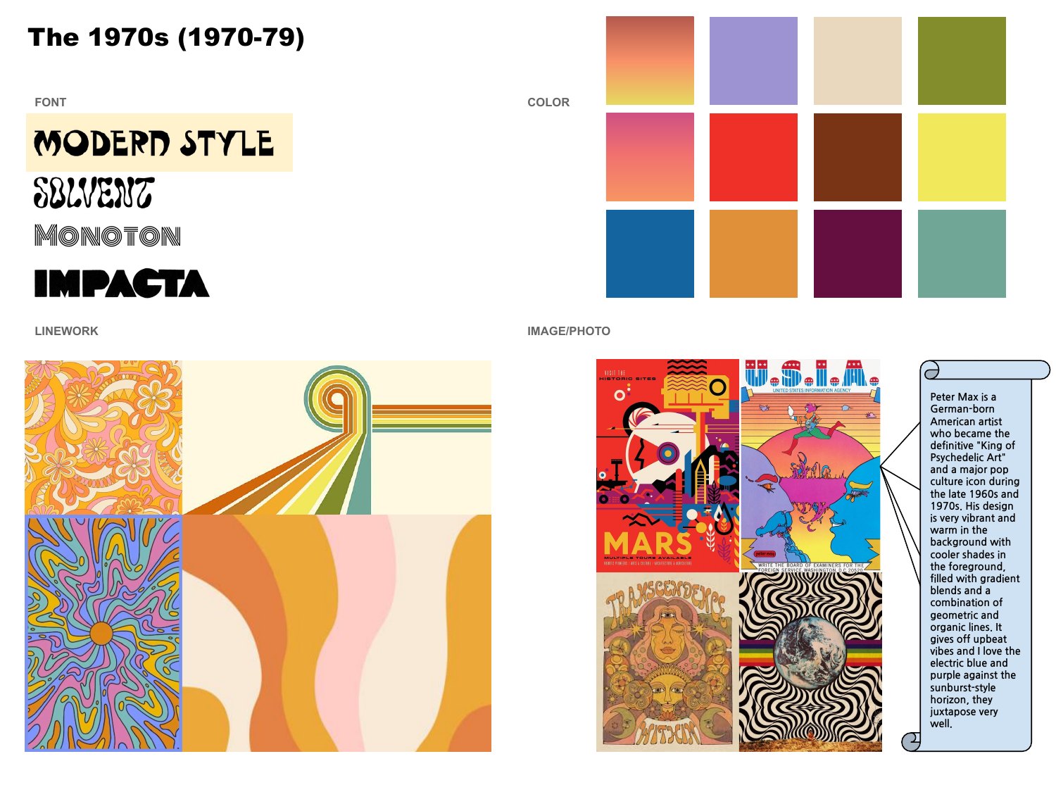
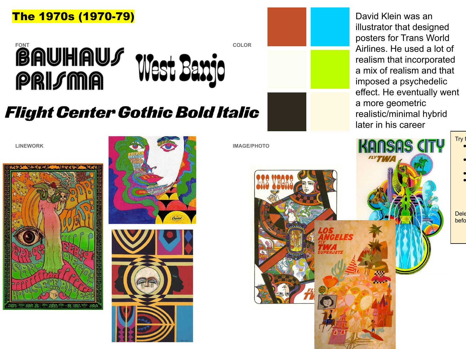
Fourteen students submitted a period board, and six included written research on a designer of their era. A selection is below, shared with names blocked out. The research habit carried straight into the next week, when the same students built design boards for their own portfolios.
Student period boards
1970s · Judy Chicago note
1970s · Peter Max note
1970s · David Klein note
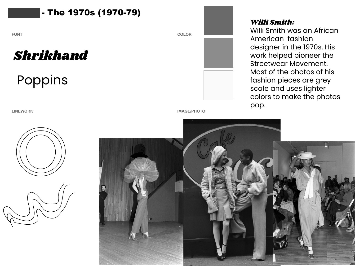
1970s · Willi Smith note
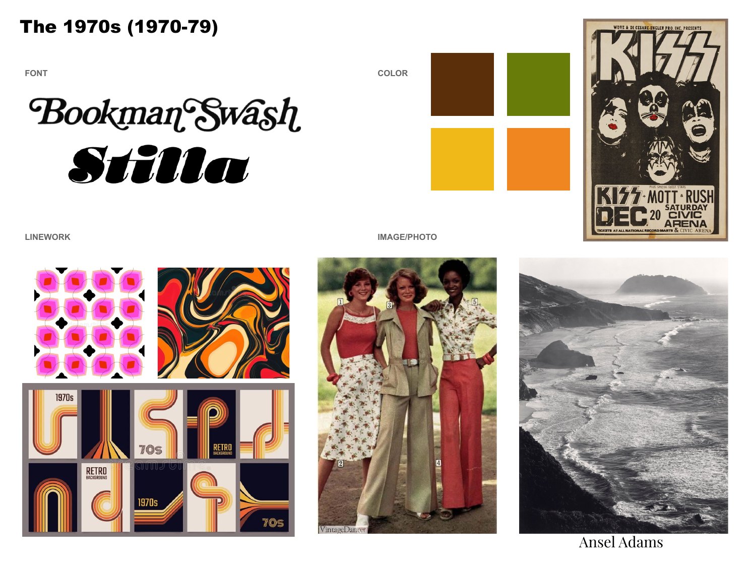
1970s
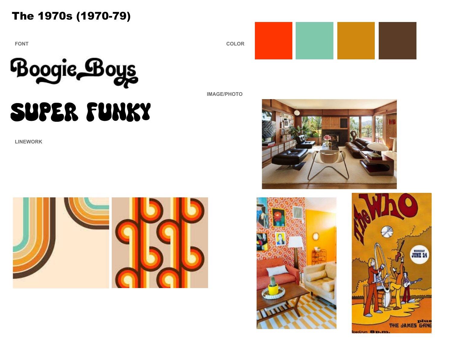
1970s
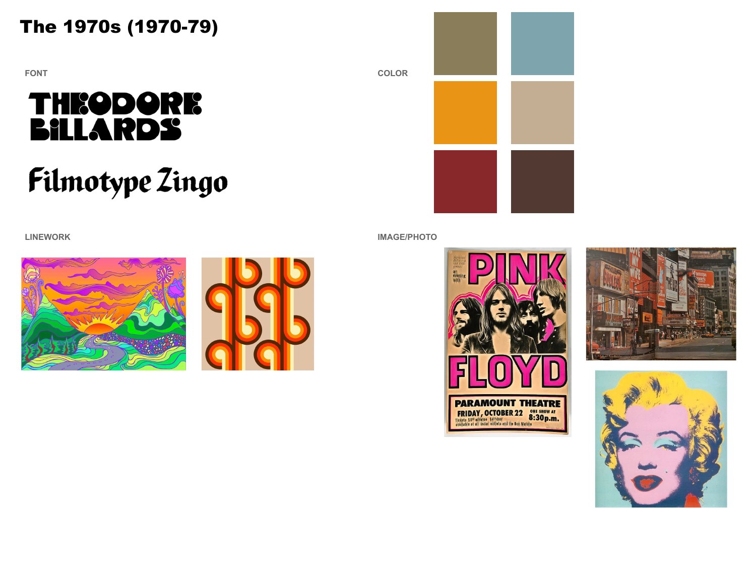
1970s
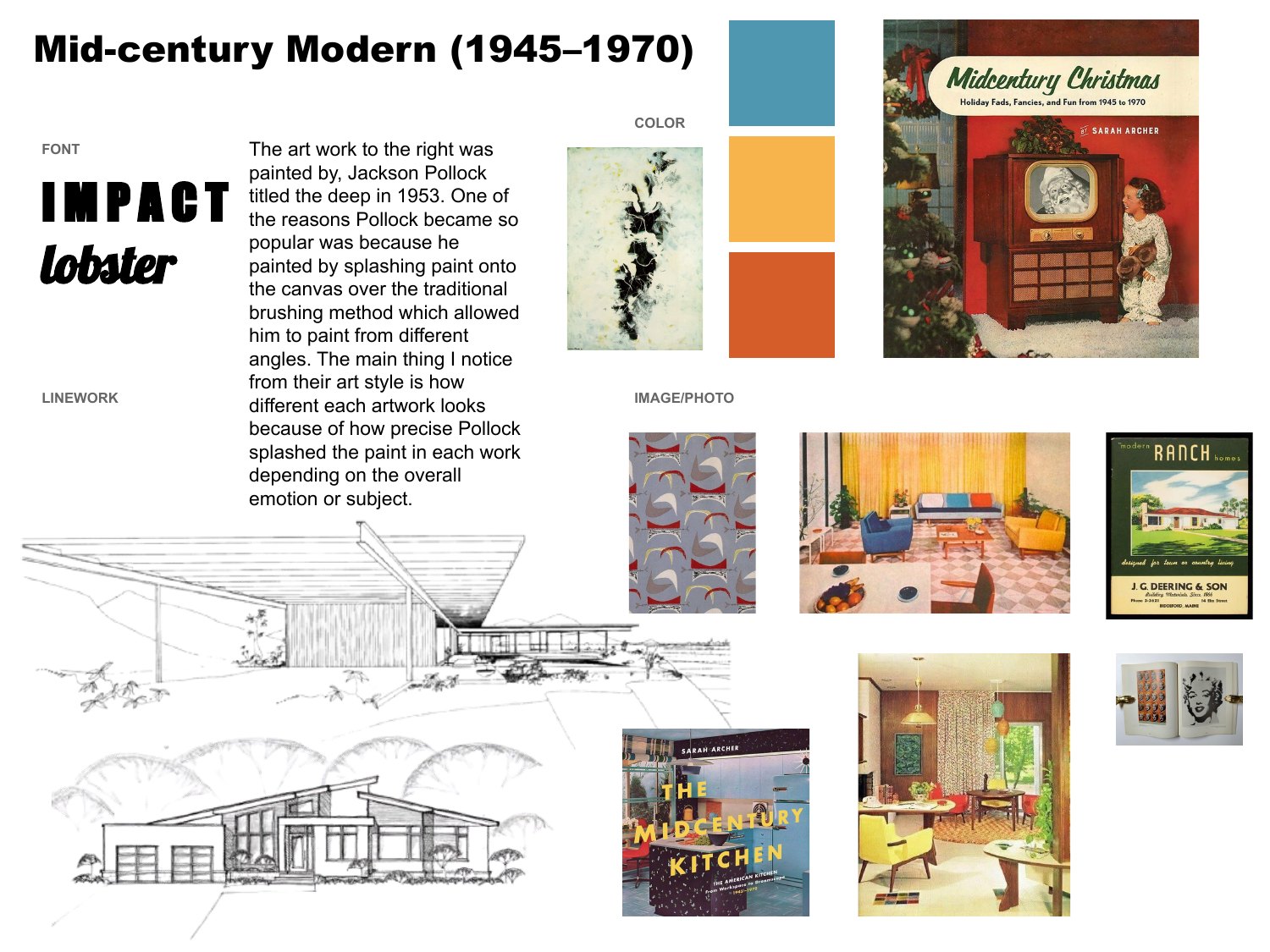
Mid-century Modern
What I'd change: The files show who submitted, but not how well. Next time I'd keep rubric scores and a line of feedback for each board, so I could show how the work improved.